How to make icons with light diffuse effect
Back to ten years ago, designers prefer transparent icons and letters to create a different view presentation when backlit on. Now, designers are seeking for a softer, more even, comfortable and harmonious look, but how to create such effect?
There are 3 ways to meet it as below illustrated.
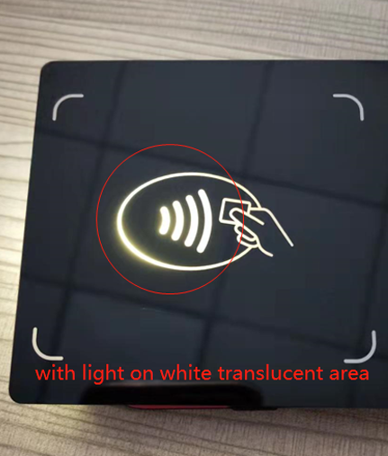
Way 1 add white translucent ink to create diffuse look when backlit on
With added a white layer, it can decrease the LED light transmittance by 98% at 550nm. Thus, create a soft and uniform light.
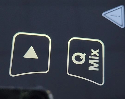
Way 2 add light diffusor paper underneath the icons
Different from way 1, it is kind of a light diffusor paper which can be applied at the required area on the glass back. The light transmittance is below 1%. This way has a softer and uniform light effect.
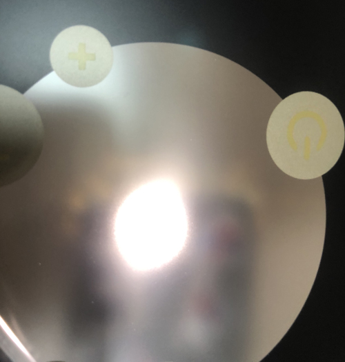
Way 3 use anti-glare glass for less dazzling look
Or add anti-glare treatment on the glass surface, which can change the direct light from one direction to various directions. So that, the luminous flux in each direction will be reduced (the brightness is reduced. Thereby, the glare will be decreased.
All in all, if you are looking for a very soft, comfortable diffused light, way 2 is more preferable. If need less diffuse effect, then choose way 1. Among them, way 3 is the most expensive one but the effect can last as long as the glass itself.
Optional Services
Customized production specific according to your design, production, special demand and logistic needs. Click here to chat with our sales expert.


